Collage Advertisement
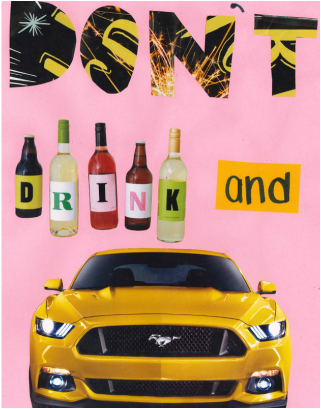
My add advertized against drinking and driving. On the top of the image were the large letters "DON'T" in a black and yellow color scheme. Then in the center of the add, were 5 alcohol bottles and on each bottle spelling out the word "DRINK." To the right of the bottles was a hand drawn "and" on yellow paper to follow the yellow and black color scheme. And finally, on the bottom of the add, I put a yellow and black mustang to summarize the "driving" sense of the message "don't drink and drive." All of this is over a light pink background. In my add, I focused on the element color, and the principle balance. By completing this project, I learned about how add companies use the elements and principles to capture the audience's attention.
Business Brochure
|
|
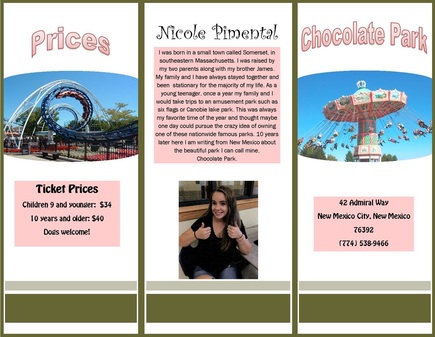
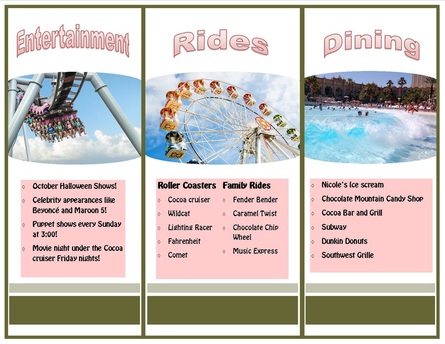
In this project, I made an advertisement for an amusement park. In the advertisement, I included the admission cost of the tickets for adults and children to get in. I also included the address of the park and the phone number to call for guest services. The brochure also includes a list of the entertainment the park offers such as concerts and puppet shows. There is also two lists of rides. The family friendly rides, as well as the roller coasters. And finally, a short biography on the back cover with a picture of myself. I used a color scheme of pink and green.
Celebrity Greeting Card
|
|
|
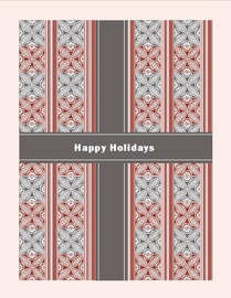
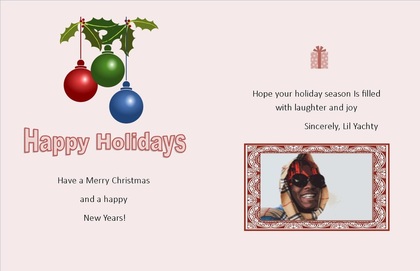
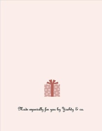
In this project, we had to design a greeting/holiday card from a celebrity of our choice. In my project, i used a template that had a front cover designed to look like the top of a present. I used a red/pink color scheme on all three pages. On the front cover i titles the card "Happy Holidays." In the middle pages i used word art to put a title of happy holidays. I also used clip art and pasted a small picture of ornaments in the top left corner. Below that, i wrote "have a Merry Christmas and happy new years" on the left side of the page. Then on the right side of the inside cover i wrote a small note and then included a picture of the celebrity i chose, Lil Yachty. Finally, on the back cover of the greeting card, i used clip art and pasted a small present with a small message saying, "Made especially for you by Yachty & co."
Business Flyers
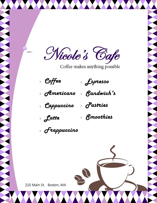
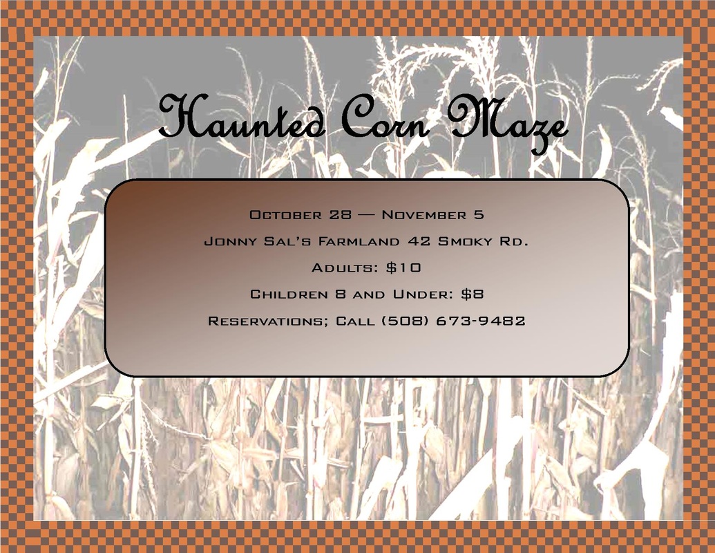
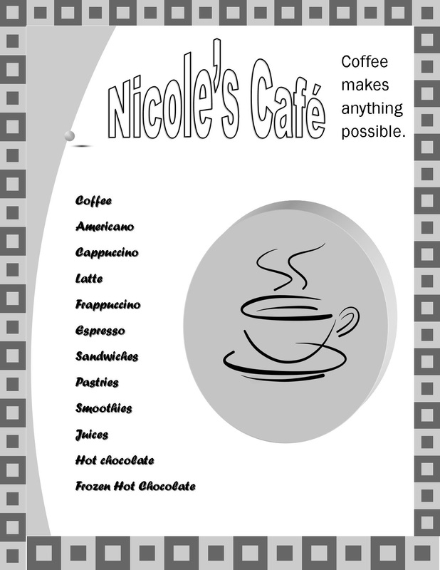
I made three business flyers. In the first flyer I advertised a cafe i created called "Nicole's Cafe." On this flyer, i used a template and changed the color scheme to purple. I also created a slogan that says "coffee makes anything possible." Then i added a purple and back zig zag border to go along with the theme. also on this flyer i put all the possible things you could order at the cafe along with a clip art image of a coffee cup in the bottom right corner. On the second flyer i advertised a haunted corn maze. On this flyer, i used a black and orange border because i wanted a Halloween theme. In the center, i included the dates the corn maze will be open, the name of the farm, the address, the prices of the tickets, and the phone number to contact the farm. then on the last flyer i created a similar flyer as the first one, but in black and white. I used a different clip art font and border and changed the order of the text.
Thayer Street Brochure
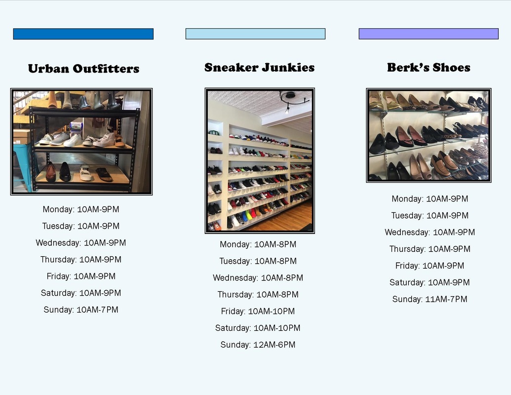
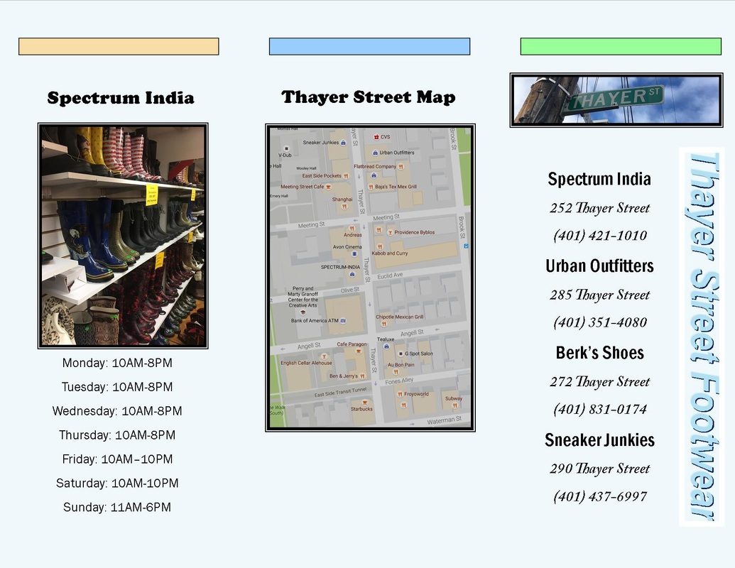
This is a brochure to all of the shoe stores on Thayer St. in Providence Rhode Island. On the front cover i used word art and printed "Thayer Street footwear" in blue on the right side. Then i put The name of all the stores I recorded and their phone number. Then, on the inside cover i put all 4 stores i recorded and a picture of each. below that i put the hours of each store. Then, on the back cover, I pasted a map of Thayer St.
